Posted by Must Have Bins on 3rd Jul 2018
Surrounding yourself with useful and beautiful things:
using the konmari method and William Morris inspired interior design
The Konmari Method – Surrounding Ourselves With Joy
Unless you’ve been living under a rock with no access to social media for the last year, you’ve probably heard of the Konmari method, the Japanese tidying method that teaches the key to happiness is surrounding ourselves only with things that bring us joy.
But Marie Kondo, the guru behind the Konmari method, is not the first to make the link between joy-bringing objects and happiness. Back in the 19 th Century, textile designer William Morris wrote that we should not have anything in our homes that isn’t useful or beautiful.
William Morris inspired interior design is still highly influential around the world. To this day, Morris is a widely influential designer. His iconic floral patterns are instantly recognisable, and many other designers have followed in his footsteps to use bold florals, daring patterns and rich colour for their interiors and accessories.
We look at some ideas for bringing joy into your interior design scheme, inspired by William Morris.
William Morris inspired design - the power of flowers
When most of us think of William Morris, we probably think of flowers. His floral patterns are his most famous, sunflowers, marigolds, pimpernels and golden lilies curling around each other in subtly repeating patterns and glorious colours. Morris reckoned that bringing reminders of the natural world into the home was essential to our happiness. He said that 'any decoration is futile ... when it does not remind you of something beyond itself'.
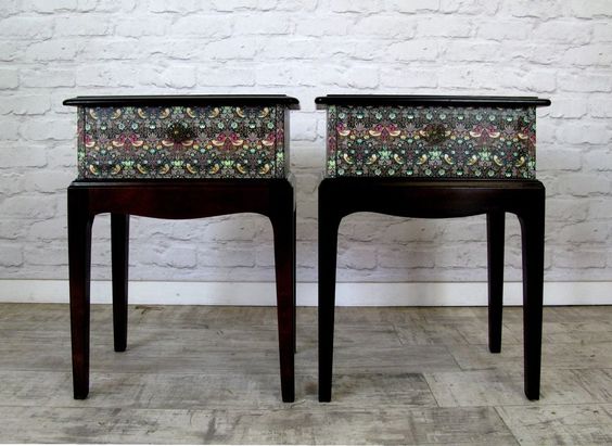
Intricate and sometimes large-scale floral designs like these can be difficult to use without overpowering a room, but using a pattern on a single piece of furniture or an accessory can create a striking focal point for a design scheme. Our vine decoupage floral wastepaper bins are inspired by Morris’s flower designs and make eye-catching accessories for a room.
Wall to wall William Morris wallpapers
Today, William Morris is probably best known for his wallpaper designs. He designed more than 50 wallpapers and all of them used flowers in the design, with patterns so intricate that it’s often very difficult to see where the pattern repeats, giving a naturalistic effect.
When his company Morris and Co. originally produced William Morris wallpapers, they were hand-painted and very expensive, but these days there are plenty of Morris-inspired designs available, as well as reproductions of the originals.
If you’re wondering how to use such bold, colourful pattern without overwhelming your room, we can actually take Morris’s own advice on this. He said that people should choose wallpaper depending on what the room was like, and what it was used for.
'…if there is a reason for keeping the wall quiet choose a pattern that works well all over without pronounced lines, such as Diapers, Mallows, Venetians, Poppys, Scrolls, Jasmine, etc. […] … if you venture on a more decided patterning ... you ought always to go for positive patterns ... the Daisy, Trellis, Vine, Chrysanthemum ... Acanthus or such'.
Some William Morris wallpaper designs are so large they need two widths of paper to complete the pattern repeat, but Morris thought that even these big designs could still work well in small rooms.
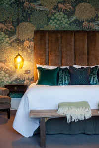
This stunning wallpaper uses large scenes that might risk overwhelming a room, but it works beautifully contrasted with blocks of white and brown in furniture and carpet.
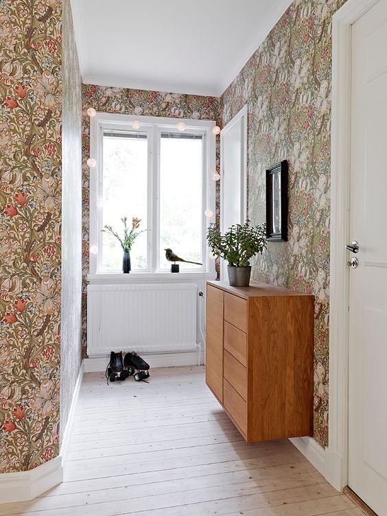
The classic Morris design Golden Lily is used throughout this hallway, but matched with clean white paintwork and bare wooden floor it doesn’t overpower the small space.
Colour contrast
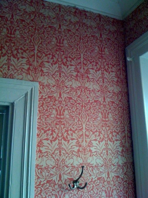
A very effective way of using a William Morris inspired pattern is to contrast its dominant colour with a complimentary colour, like this striking pairing of rose pink wallpaper with duck-egg blue paintwork.
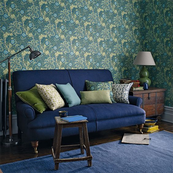
Or this navy blue couch and blue rug bringing out the bright blue highlights against the green background in this pretty wallpaper.
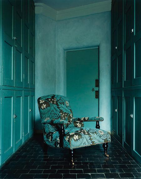
Or use pattern and block colour the other way round, using a William Morris inspired focal point piece of furniture against a single colour wall, like this floral chair against a teal background.
